A brief history of the numeric keypad
Written by
Francesco Bertelli
Art Direction by
Manoel do Amaral

Picture the keypad of a telephone and calculator side by side. Can you see the subtle difference between the two without resorting to your smartphone? Don’t worry if you can’t recall the design. Most of us are so used to accepting the common interfaces that we tend to overlook the calculator’s inverted key sequence. A calculator has the 7–8–9 buttons at the top whereas a phone uses the 1–2–3 format.
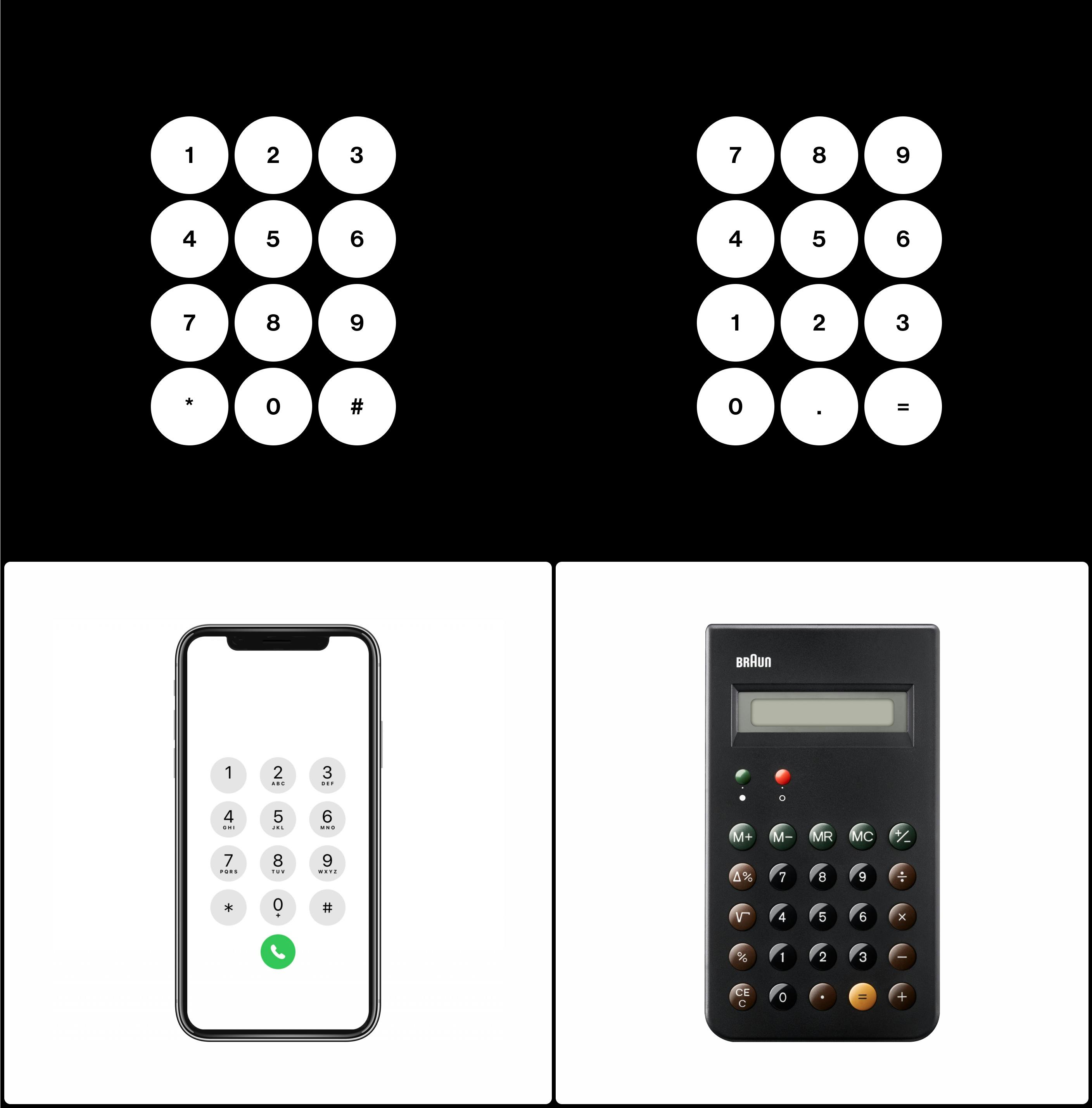
Telephone (left) and calculator (right) keypads
Subtle, but puzzling since they serve the same functional goal — input numbers. There’s no logical reason for the inversion if a user operates the interface in the same way. Common sense suggests the reason should be technological constraints. Maybe it’s due to a patent battle between the inventors. Some people may theorize it’s ergonomics.
With no clear explanation, I knew history and the evolution of these devices would provide the answer. Which device was invented first? Which keypad influenced the other? Most importantly, who invented the keypad in the first place?
Typewriters, Cash Registers, and Calculators
Looking at the key arrangement, I was curious to learn when the system of using keys was introduced in the history of machines. The keyboard came about sometime between the first and second industrial revolutions (from 1820 to 1920). Some inventors had already begun experimenting with machines similar to pianos in the late 18th century.
However, it wasn’t until 1844 that a Frenchman by the name of Jean-Baptiste Schwilgué came up with the first working prototype of a key-driven calculator machine. This machine used the first numerical keyboard with a single row of keys that increased from 1 to 9 (Dalakov, 2018).
In all fairness, though, we have to mention two predecessors that could claim they invented the key-based interface. In 1834, Luigi Torchi reportedly showed a prototype of a wooden calculator, with a design similar to the typewriter. In 1822, author James White’s New Century of Inventions showed a key-based device with nine numeric keys. Neither one stood up to the test of time, nor no proof was given that they weren’t just fantasy (Durant, 2011).
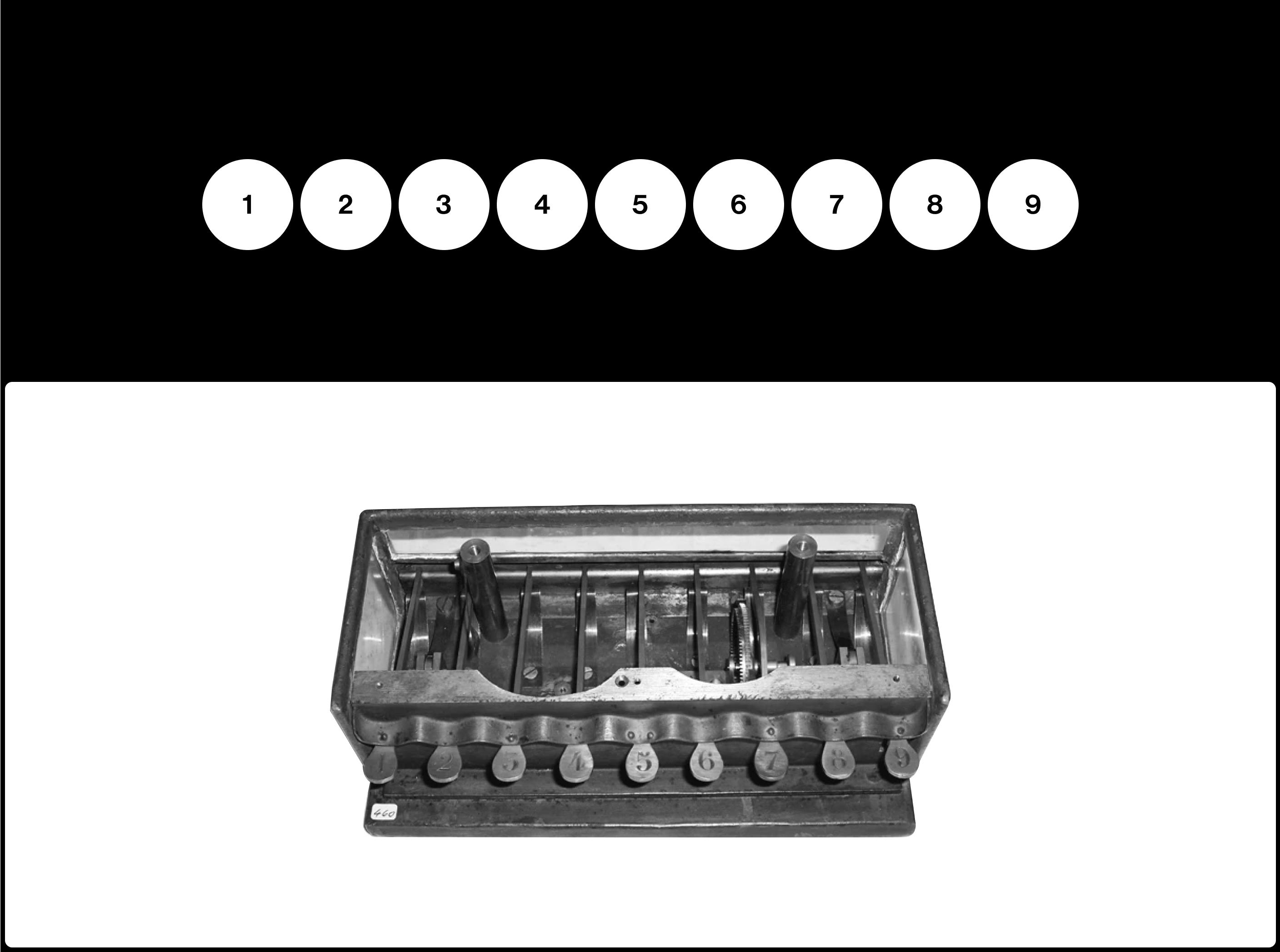
Jean-Baptiste Schwilgué’s adding machine keyboard (1844)

James White’s machine layout (1822)
Still, White’s machine, even if it was a proof of concept, could certainly be regarded as the earliest example of modern “direct-manipulation” interface. This interface that allows users to focus on the input without the need to operate the bare mechanisms such as the Pascaline or array of Arithmometers that use drums, clocks and unfriendly levers (Dalakov, 2018).
However, these “ideas” still don’t provide an explanation as to why modern calculators use the reverse 9–0 arrangement.
Theories include the suggestion that the calculator was based on the cash register design. Think about it, the currencies used in that time meant the number 0 was often the most pressed key. So, it would make sense to keep that number at the very bottom to ensure it was within hand’s reach (Durant, 2011).
While there is some truth to the explanation, it’s still riddled with factual errors and the hand’s reach argument was weak. This is especially so since early cash registers (until 1893) had no separate 0 key, no drawer and no workers standing behind the cash register.
For the argument to be valid, it’s important to look at the birth of cash registers.
In 1879, James Ritty owned a saloon in Dayton, Ohio where he found some of his employees were stealing his profits. After seeing a tool that counted the revolutions of a steamboat’s propeller, he invented the machine that featured a clock-wise device and a set of numeric keys (Dalakov, 2018). The predecessor to today’s cash register was not meant for calculation but to record a sale and let a manager know with a ring.
Until 1893, the early register models had buttons commonly arranged in one or two horizontal rows, which displayed preset values — 10, 15, 20, 30, 35, etc. These corresponded to the price, in cents, of items sold in stores and saloons. The introduction of the three vertical rows of digits didn’t happen until 1894 when the NCR Model 79 became available.
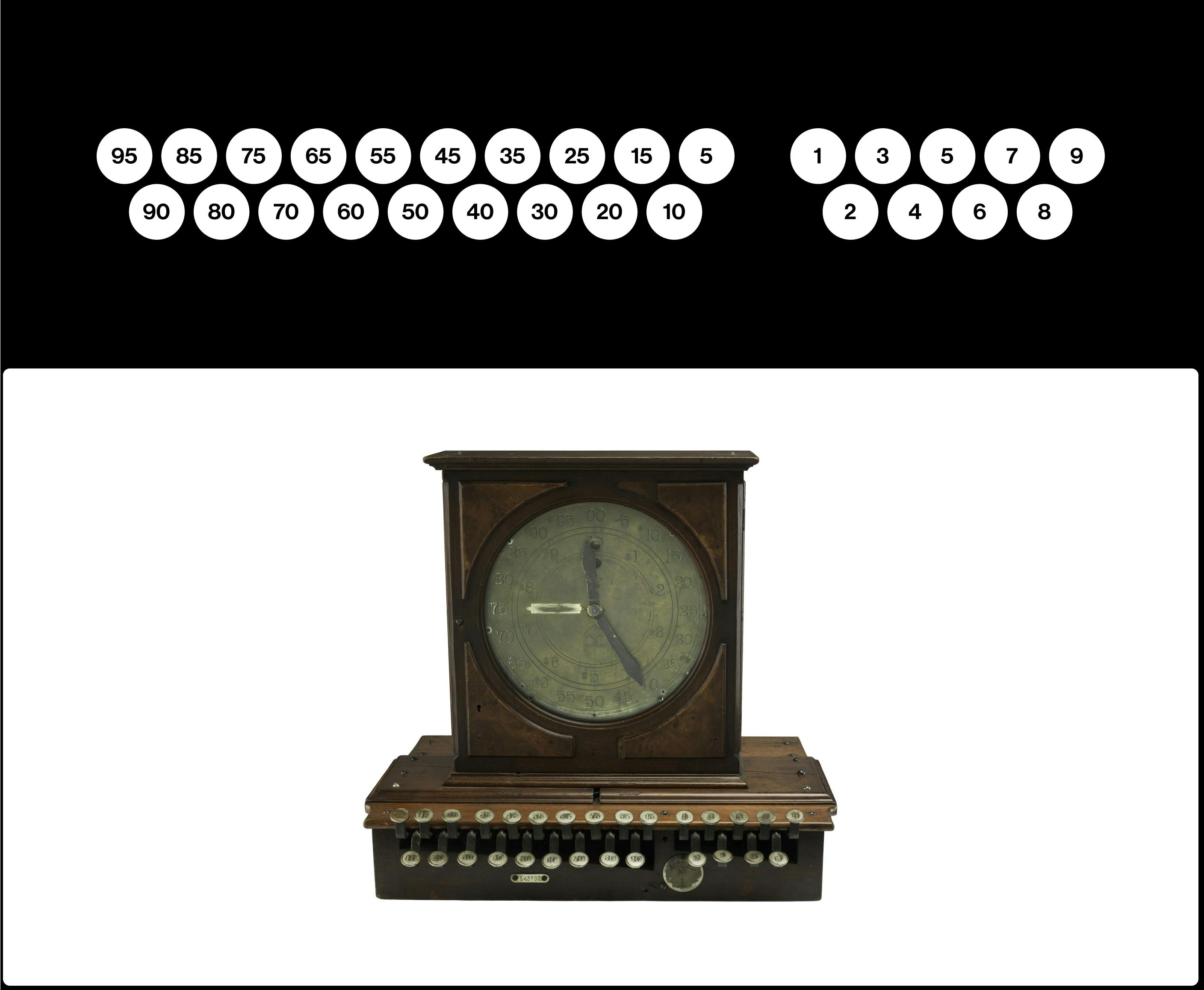
Ritty’s first cash register, invented in 1883
Still, there is even earlier evidence that suggests vertical columns were already invented.
In 1884 Dorr Felt had a bright idea of a machine that was capable of solving operations with large numbers. The idea was based on the Pasacline’s mechanism, the layout of Thomas Mill’s machine and a macaroni box. It was known as the Comptometer, a device with eight columns of keys that range from 9 (on top) to 1 (on bottom) where each column represented a decimal position. Keep in mind that 0 was still not a part of the key sequence. History shows that it was a 9 to 1 sequence (Dalakov, 2018).
Cash registers were still in the process of catching up.
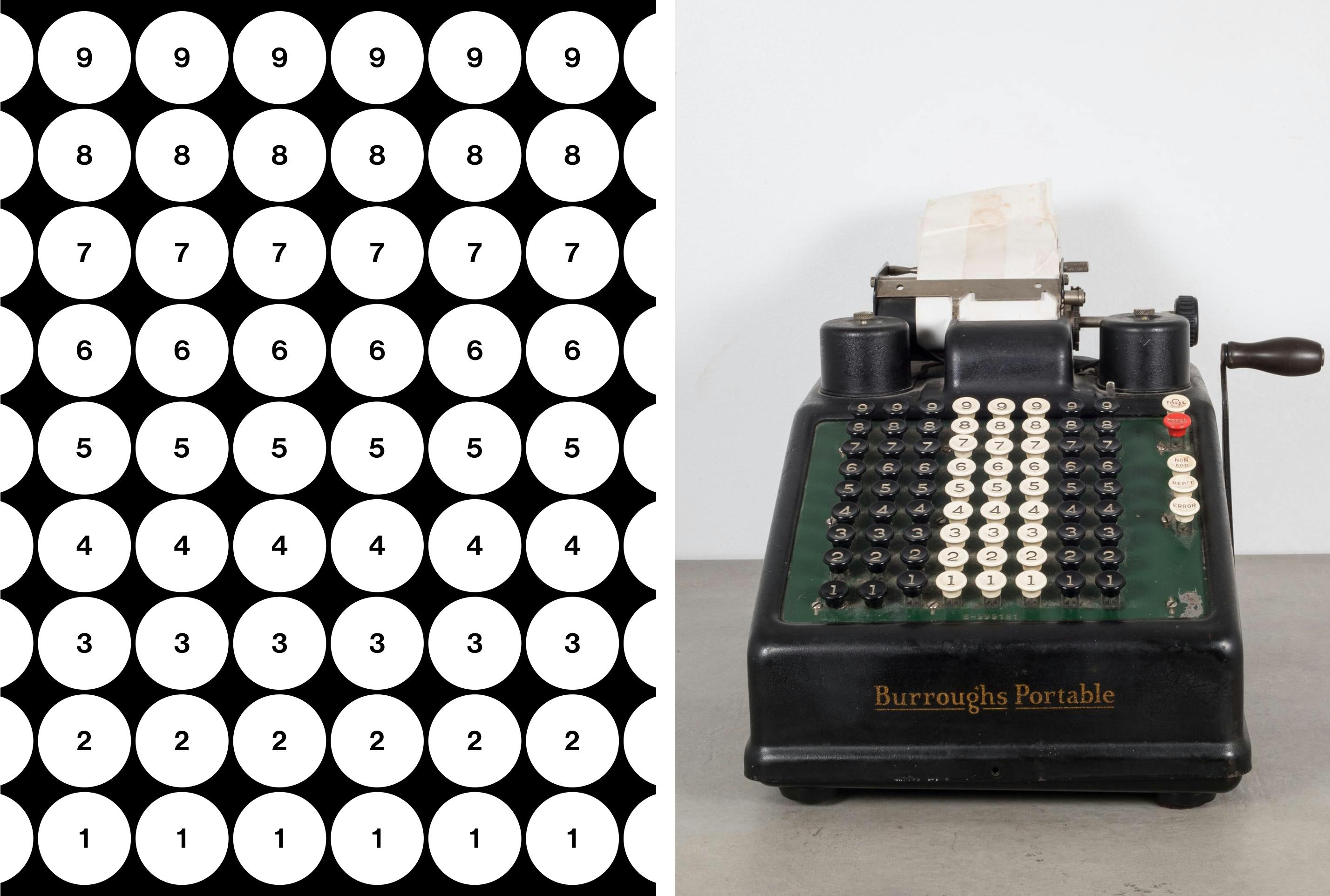
Comptometer’s layout, invented in 1885 (right)
Here is where the story gets interesting. Why did Felt choose to display the numbers in a 9 to 1 sequence? It wasn’t a widespread notion at the time. After all, the knowledge of arithmetical devices was not as widespread.
A reasonable answer could be tied to some mechanical decisions, possibly related to the method of complements and the fact that keys were pressing levers connected to rotating drums (Durant, 2011). The longer stick was equal to a longer rotation, which meant to be the number 9, as opposed to number 1 which required a shorter rotation — a suggestion from an older concept by Parmelee.
Another interesting explanation — from a modern design standpoint — goes beyond the mechanical reasons. According to the Comptometer Manual, operators were meant to input numbers by using the lowest values on the keyboard. For instance, in order to enter “9 cents”, the operator was not supposed to press the 9 key at the very right column. Instead, they were to press, in sequence, the 4 and 5 key. The machine would do the math. Reaching for the “9” key was deprecated because it decreased the figuring speed if users had to move their right hand from the bottom. Felt was all about efficiency, which meant keeping commonly used keys within the fingers’ reach. It seems this need for efficiency led to this user-centered design layout, but it was still not considered a user-friendly interface (Meehan, 1952).
The Comptometer and its competitors required highly-trained users to attain maximum productivity. It was also difficult to do with one hand, especially when it came to multiplications.
In 1902, the Dalton went on to become one of the most popular 10-key adding machines of the time, rendering multi-column calculators obsolete. Dalton was a miniature version of a typewriter and had two rows of five buttons with an odd arrangement — 24579 at the top and 13068 at the bottom. What’s different in the arrangement that was not seen up until now? (Durant, 2011)
That’s right! The 0 finally appeared in a sequence.
The Dalton was a major improvement, combining the printer and calculator into a smaller size and adding a new kind of keyboard that went beyond the literal arrangements for decimals. Bookkeepers around the world rejoiced when the development of the Dalton (Dalakov, 2018).
The quest for further development continued.
In 1914, David Sundstrand, a Swedish-born American man, filed patent №1198487 under the name Sundstrand Corporation. The goal was to push the usability of these adding machines further. He rearranged the key in a more “logical, natural configuration.” It was based on a 3x3 layout, beginning with 789 at the top and a larger 0 at the bottom. It could be operated with one hand, which made it “the fastest keyboard of all adding machines.”
The layout became the standard for calculator keypads — even 100+ years later.
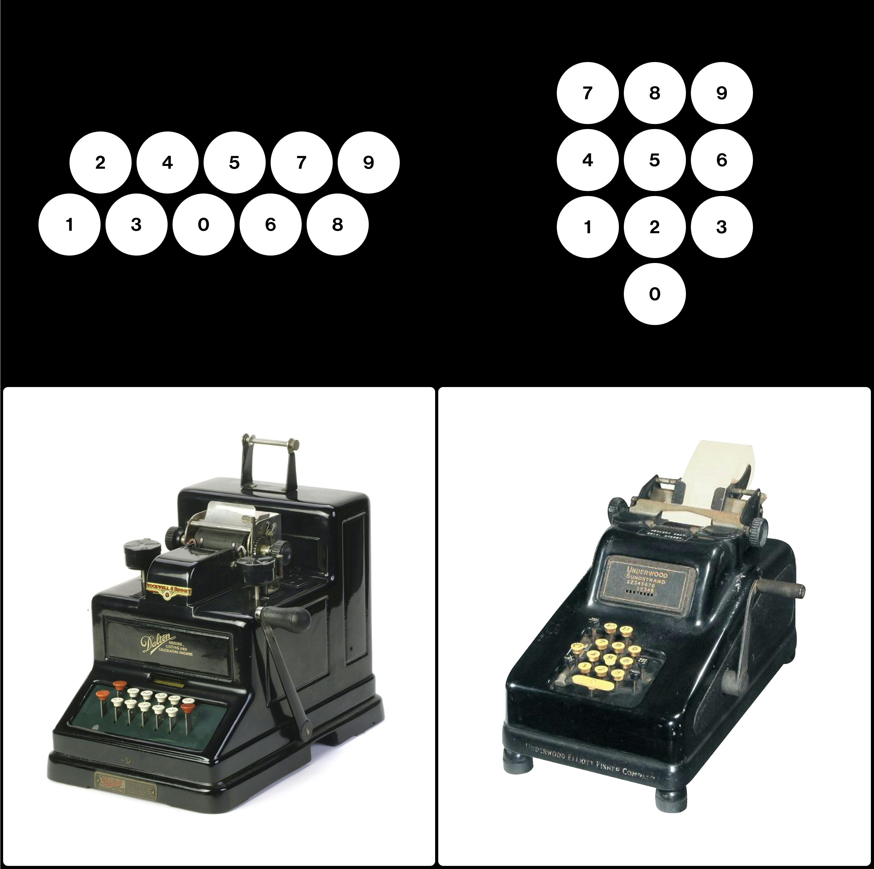
Dalton’s 10-key adding machine, 1902, and Sundstrand’s 10-key adding machine, 1914
From Calculators to Telephones
Does the evolution of calculators prove its influence on modern phones? Possibly, but there’s no straight answer. Bell Telephone Company, the company who helped invent and popularize long distance phone call technology, was already experimenting with push-button phones in 1887. This was at a time before the rotary dial was invented — a device that could be attributed to Almon Brown Strowger in 1892. Western Electric commercialized the device in 1919, but never gained popularity because the buttons were shortcuts not tied to numbers.
It isn’t until the 1950s that direct distance dialing expanded to a significant number of communities. Local numbers (usually six digits or less) were then expanded to a standard seven-digit named exchange. A toll call to another area, resulted in 11 numbers, with the number 1 being the first number dialed (Durant, 2011).
With increasing length of phone numbers, the number of misplaced calls rose, which led to AT&T engineers wondering if it were due to the keyset toll operating were using (image below).
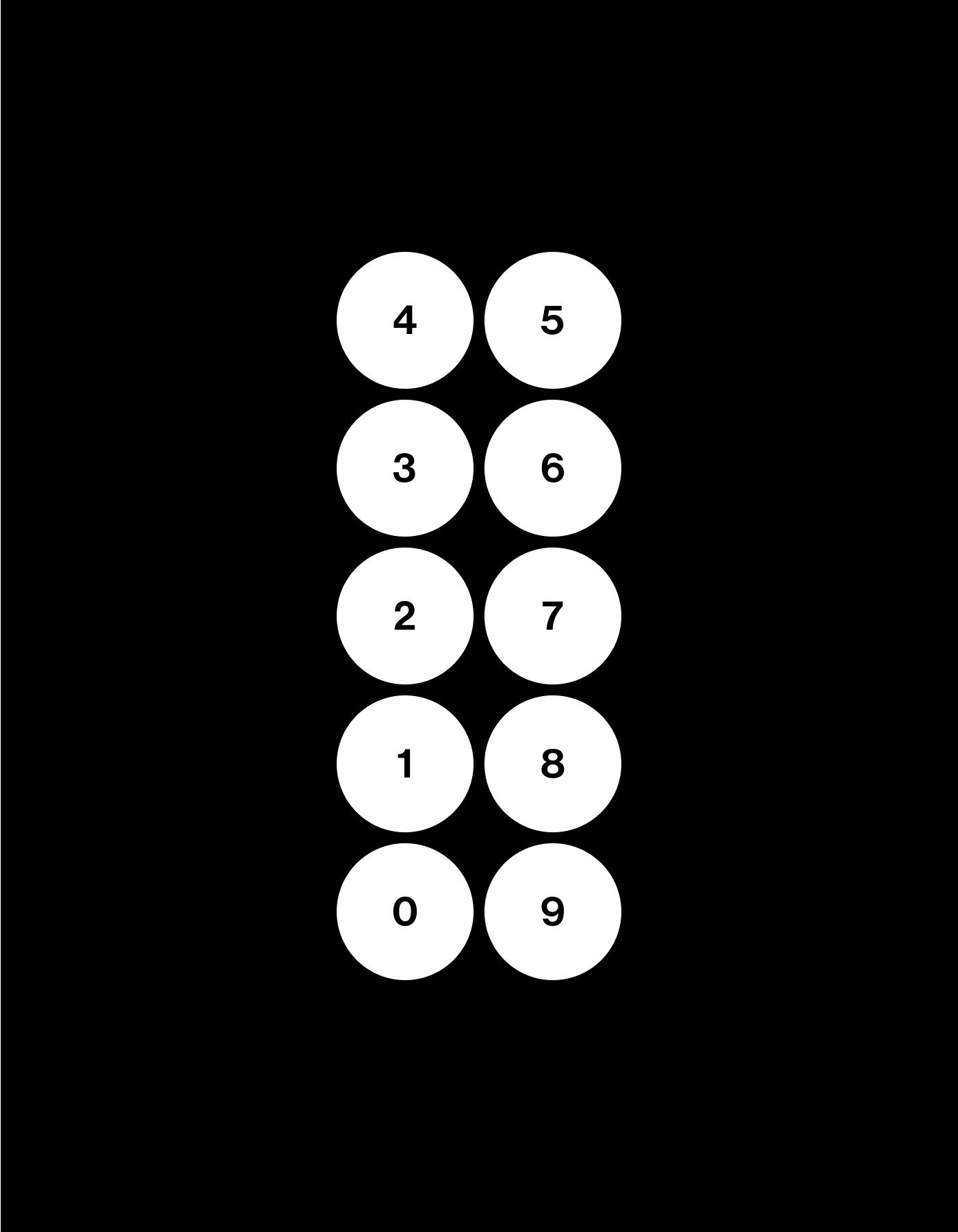
In the 1955 study of Expected locations of digits and letters on ten-button keysets followed by the 1960 Human Factors Engineering Studies of the Design and Use of Pushbutton Telephone Sets, there were multiple insights offered that would lead to the modern phone design. AT&T was about to move to a new frequency called Touch Tone, which was meant to be used by push-button devices. It was important to determine which configuration would be best for users (Deininger 1960).

Key arrangements tested in the 1960 study.
The company tested 15 layouts, using odd-shaped diagonal, pyramidal, circular and horizontal arrangements and included formats found on existing devices such as calculators and punch card machines like the IBM Model 011. Surprisingly, the calculator layout didn’t do so well, and users preferred a left-to-right, top-to-bottom layout. (Deininger 1960).
In particular, the 2-rows of 5 horizontal version (5–5-H) was as fast as the modern 3x3+1 layout, but the difference was only marginal. AT&T opted for the 3x3+1 layout, perhaps due to its compact format and versatility.
Now ‘perhaps’ is the keyword here. Both studies have not given a final, matter-of-fact answer. And the UK adopted the 5–5-H layout, again perhaps due to patent reasons.
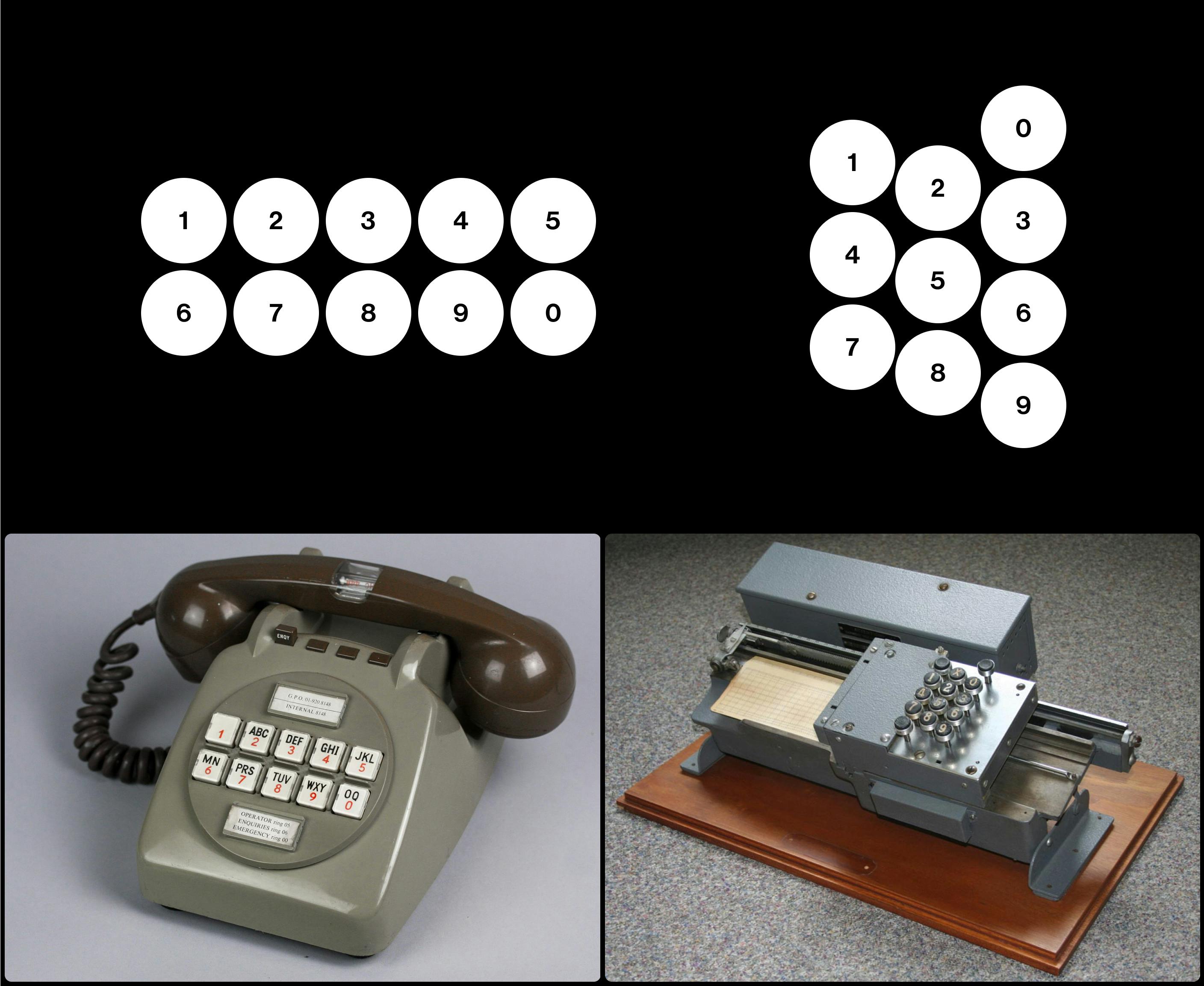
British telephone with 5–5-horizontal layout, 1960s, and IBM Model 011, one of the early 10-keypunch machine, 1940s
Something interesting to mention regarding both studies — letters never played a part in how the configuration would be laid out. While people wanted the left-to-right order for numbers, they demonstrated more speed and accuracy independent from the letter arrangements (Lutz, M. C., & Chapanis, A. 1955). Theories that want the alphabet order to be the primary were proven wrong, which is why the layout is the way it is today.
Design Decisions and Conventions
There is a multitude of factors that go into the design decisions such as technology and its limitations, ergonomics, user perception and familiarity with existing formats. The latter appears to be the strongest criteria, as it’s the most common choice people make in the digital age. No physical constraints, other than the screen real estate that limits designers’ creativity. Look at your Android or iPhone apps. You’ll notice that both the phone and calculator layouts are similar to the ones invented a century ago.
Why is that? The only real explanation for why digital apps still adhere to conventions is that people would rather interact with familiar interfaces instead of learning new ones. Possibly these interfaces reached the maximum optimization an interface can have.
In fact, it’s quite interesting to notice that both Android and Apple iOS, in their early versions, used the phone keyset as the default interface when users were prompted to input numbers in a web text field (see screenshots below. Most recent version of the iOS prompts the special characters board instead). On the other hand, Oculus Go, is adopting the calculator layout for any numeric input (I tested it on a web application).
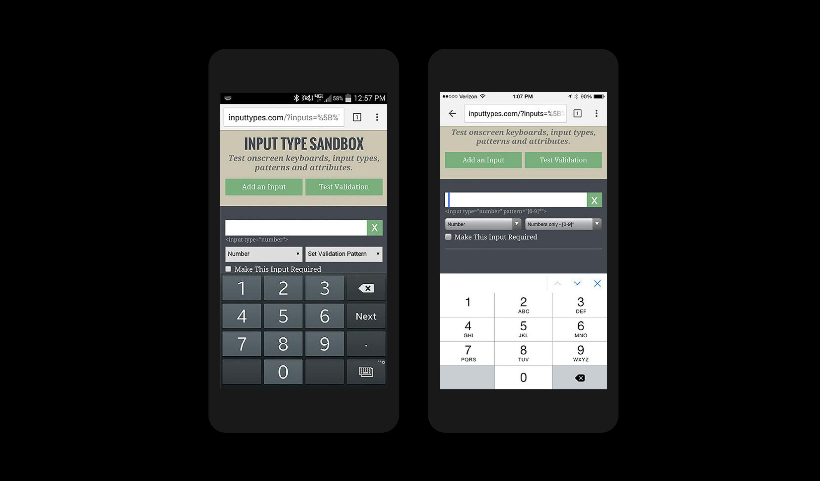
Android 6 left, iOS 9 right (http://inputtypes.com)

Oculus GO Keyboard (2018) — Source
So, why did Apple and Google choose the phone layout over the other — even keeping the letters underneath the numbers? Why not create a special numeric keypad optimized for the thumb touch for the phones or a special keyboard easier with pointing devices in the case of VR devices? Considering that none of the two historical layouts have been advantageous for speed, the only advantage is the readability, and most likely the reason lays in low maintenance and reuse of existing patterns within the software: smartphone keep the legacy of phones. Oculus, Xbox, choose the legacy of desktop applications.
Timeline
- 1642: Blaise Pascal’s calculator
- 1822: James White’s concept of a key-driven calculator machine
- 1844: Schwilgué’s machine, first numeric keyboard in history
- 1857: Thomas Hill’s machine, ancestor of the comptometer
- 1874: E. Remington & Sons began to manufacture and market a subsequent model of the Sholes & Glidden Type Writer
- 1879: Rittey’s first cash register in history
- 1885: Comptometer, first columns 9-to-1 layout adding machine
- 1887: Early prototypes of push-button mini-phones
- 1887: Cash register Model 79 is born — vertical columns
- 1902: Dalton, first 10-key machine (now includes the zero)
- 1914: Sundstrand’s first 10-key machine with “3x3+1” layout
- 1919: Western Electric & AT&T introduce rotary-dial telephones
- 1940: Olivetti Dividisumma introduces divisions
- 1940: IBM 10-keypunch card machine, 123 format on top
- 1955: AT&T start testing push-button telephones
- 1963: Bells introduces 10-key push-button telephones
- 1963: Canon prototypes first electronic calculator with a luminous display
- 1966: Sharp/Facit commercialized electronic calculator with a luminous display
- 2007: Apple introduces iPhone, along with a calculator app
Works cited
- Bellis, M. (2013). The History of the Computer Keyboard — From an Inventor Perspective. [online] Theinventors.org. Available at: http://theinventors.org/library/inventors/blcomputer_keyboard.htm [Accessed 9 Jun. 2018].
- Bellis, M. (2018). Who Invented the Cash Register? [online] Thoughtco.com. Available at: https://www.thoughtco.com/cash-register-james-ritty-4070920 [Accessed 9 Jun. 2018].
- Durant, W. (2011). [1912 Dalton Adding, Listing and Calculating machine]. [online] The Portal to Texas History. Available at: https://texashistory.unt.edu/ark:/67531/metapth969/ [Accessed 9 Jun. 2018].
- Dalakov, G. (2018). History of Computers, Computing and Internet. [online] Available at: https://history-computer.com [Accessed 9 Jun. 2018].
- Lutz, M. C., & Chapanis, A. (1955). Expected locations of digits and letters on ten-button keysets. Journal of Applied Psychology, 39(5), 314–317.
- R. L. Deininger (1960). Human factors engineering studies of the design and use of pushbutton telephone sets. The Bell System Technical Journal, 995–1012.
- Meehan J. R. (1952). How to Use the Calculator and the Comptometer. Published by Gregg Publishing Division, McGraw-Hill Book Company, Inc., 1–4