Graphic notation: a brief history of visualising music
Written by
David Hall
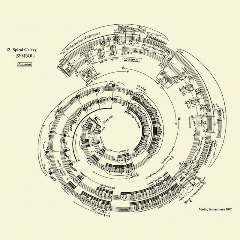
George Crumb, Spiral Galaxy (1972)
Since the output of a designer’s work is not just the product itself — comprising mockups, journey maps, flowcharts, and prototypical representation of how the product will render on a user’s device — documentation is an incredibly important tool to rally our teams toward delivering an excellent product experience.
When documenting designs, we often follow templates and standards, annotating things in a way that is both conventional and clear. We want our audience (i.e. developers who are building the product) not to re-learn our design intentions at every stage of the design.
Similarly, a sheet of music is not the music itself. Music notation is a set of instructions for someone who is “building” or “playing” the song. The reality is that design and music intersect in so many areas; fashion, art, filmmaking, set design. Yet one relatively obscure but staggeringly creative area is in the design of graphic notation used by composers. Graphic notation is one side that is relatively unknown outside the sometimes rarefied world of orchestral and experimental music. This is a great example of how breaking from the conventional system, whether in sheet music or a pattern library, can open up creative possibilities.
Composers have always grappled with ways to express themselves, and in the twentieth century, several began using this radical graphical approach to writing scores. It was a two-fingered salute to the prevailing musical establishment.
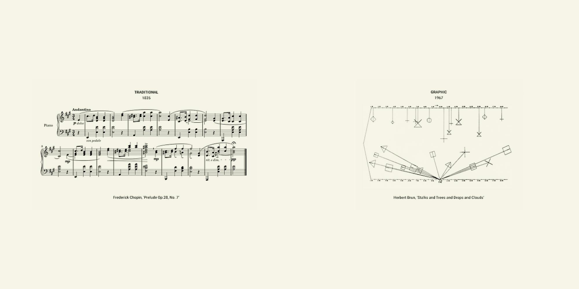
traditional music notation (left) and graphic music notation (right)
Graphic notation functions in the same way as traditional musical notation but uses abstract symbols, images, and text to convey meaning to the performers. A few of these composers incorporate traditional notation and then bend it in unique ways.
The visual comparison between traditional and modern graphic notation can be striking. Traditional notation is linear and rigid. Modern graphic notation is open, can offer flexibility, and allows the performer to interpret the composer’s ideas.
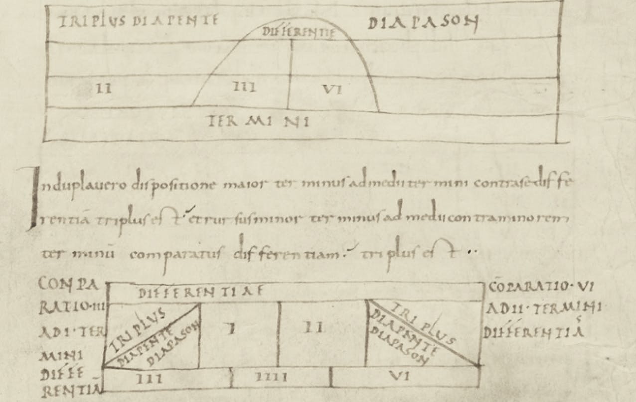
Aurelian of Réôme (840 C.E.), one of the first western music notations
It all started around 840 C.E. when a former monk named Aurelian of Réôme created one of the first examples of Western musical notation. This was a basic attempt to create a treatise on music theory called Musica discipline.
By the Baroque era in Europe, composers wanted to set down their work with greater consistency and leave less interpretation open to performers. Now musical language was becoming codified. Yet various composers like Beethoven, then Gustav Mahler in the late nineteenth century, strained to break free of the traditional boundaries. Their orchestral scores are full of scribbles, footnotes, and marks, as if sticking to the rules was too much for them.
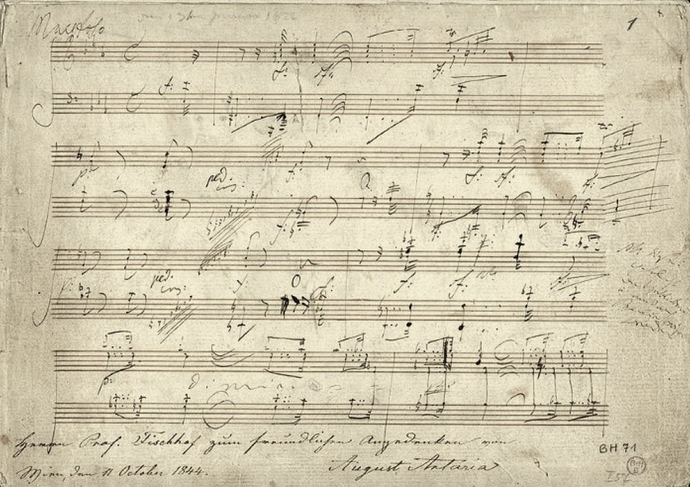
We can feel Beethoven trying to break free from the constraints of conventional notation in his score from his Piano Sonata
In the early twentieth century, composers such as Henry Cowell began experimenting with notation and his New Musical Resources (1930) was a radical attempt to change musical notation. Increasingly throughout the twentieth century and following the horrors of the Second World War, there was a growing feeling among composers that traditional Western notation was inadequate for expressing their musical ideas.
The earliest example of full-blown graphic notation within a score is Morton Feldman’s Projection 1 (1950) for solo cello. It features an entirely original notation, which looks more like a circuit diagram. It sounds and looks ahead of its time. Listen to it here.
Throughout the 50s and 60s, a new generation of heavyweight post-war composers like Krzysztof Penderecki, Karlheinz Stockhausen, John Cage, Roman Haubenstock-Ramati started using graphic notation as a serious and necessary alternative to traditional forms of notation.
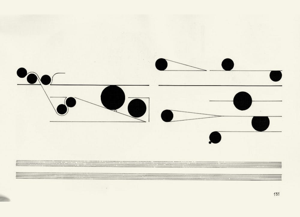
Arguably the greatest musical score ever designed, a pinnacle of graphic notation is by Cornelius Cardew, entitled Treatise (1963–1967). The piece comprises 193 pages of highly abstract scores. This is the Sistine Chapel of notation. His training as a graphic designer is obvious. He even used principles of cognitive psychology, which is central to design.
Cardew’s motivation was to inspire creativity and interpretation of the performer. The score gave no specific instructions on how to play the piece, not even what instruments to use. It’s a dense piece, allowing multiple explorations and interpretations. Following along with the score is a rewarding experience. Listen and watch the score unfold.
As the complexity and abstraction of music increased, so too did the scores. Many of the pieces that these scores are referencing are obtuse to the point of incomprehensibility, but there remains genuine beauty in them.
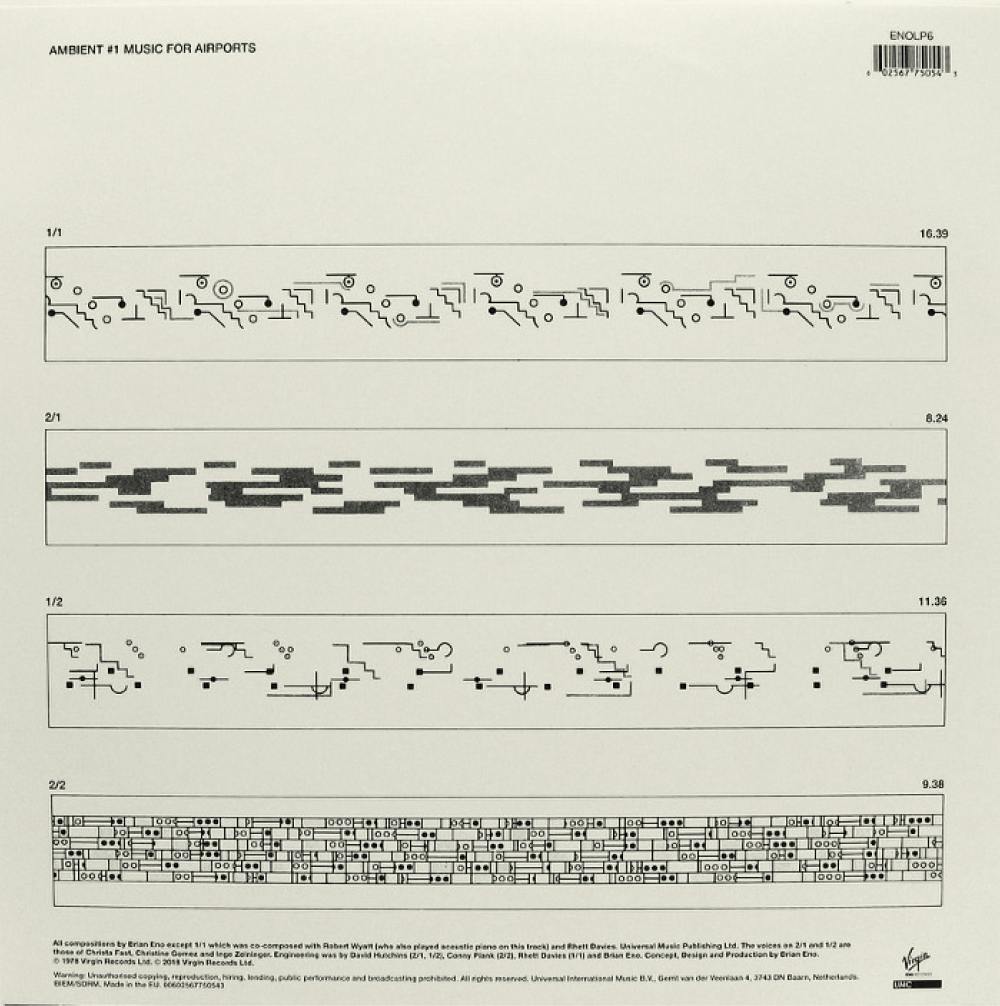
Brian Eno is one of the more well-known contemporary musicians using graphic notation. Eno is very open about not having a formal musical education and thus being unable to notate in an orthodox way. He has used graphic scores out of necessity and has made it a normal part of his process.
Brian Eno told an interviewer that ‘quite a lot of what I do has to do with sound texture, and you can’t notate that anyway… That’s because musical notation arose when sound textures were limited.’ Eno gave the musicians on the recording of Music for Airports a lot of latitude in interpreting the score with instructions such as ‘play the note C every 21 seconds. I can see the score on the back of my faded copy of Music for Airports.
As the interfaces and experiences we design become more complex and nuanced, just like the music textures Eno introduced, designers should ask themselves if the notation in place is the best way to convey what they want to communicate and achieve to their users and business.
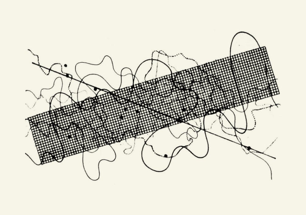
John Cage, Fontana Mix (1958)
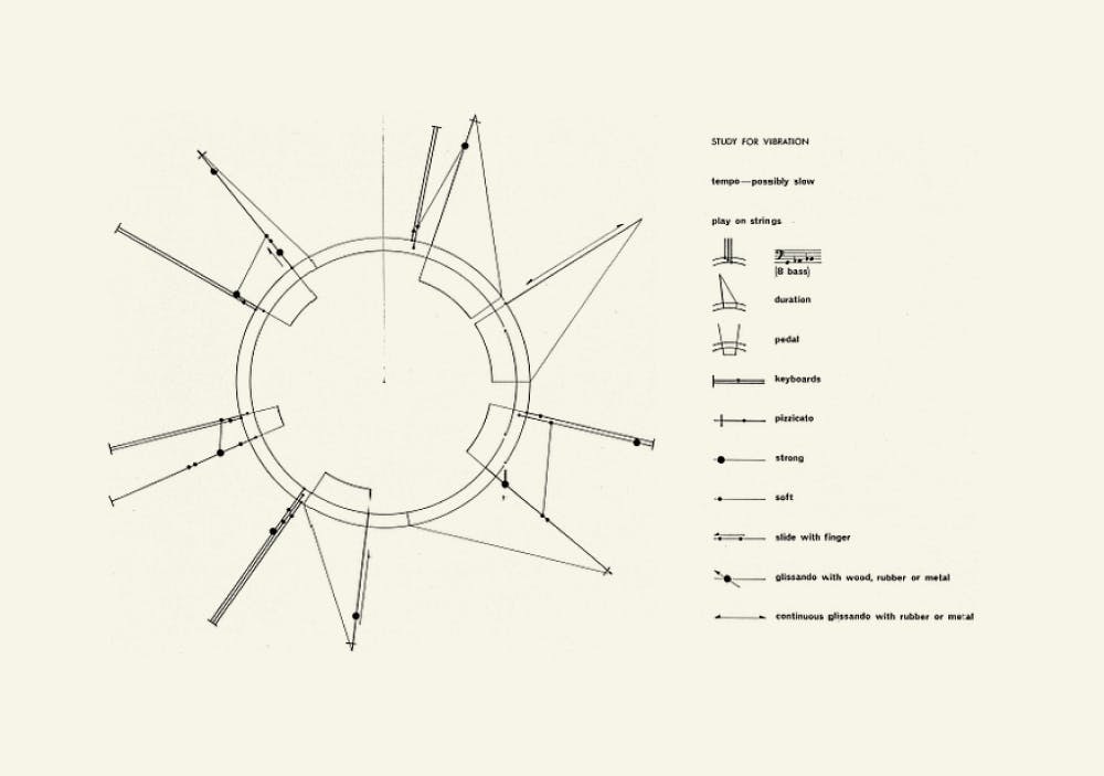
Toru Takemitsu, Study for Vibration (1962)
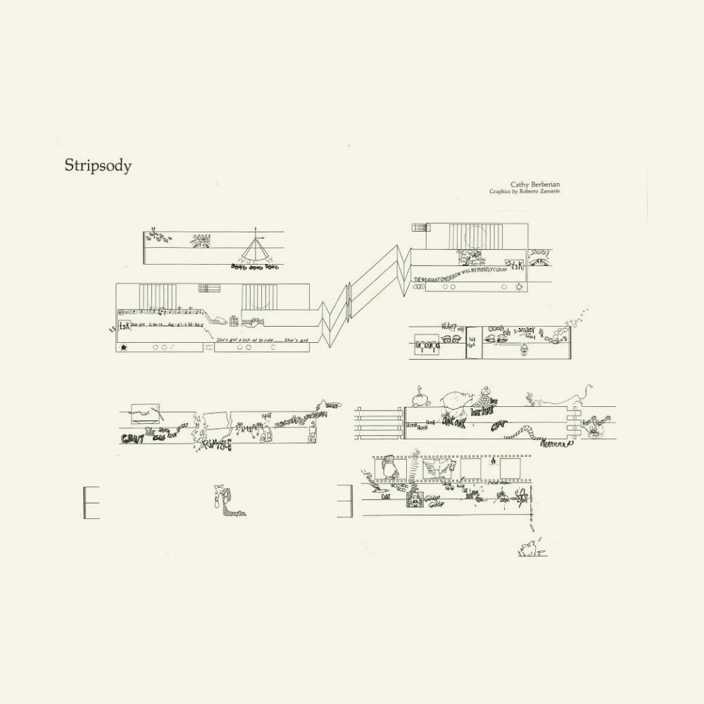
Cathy Berberian, Stripsody (1966)
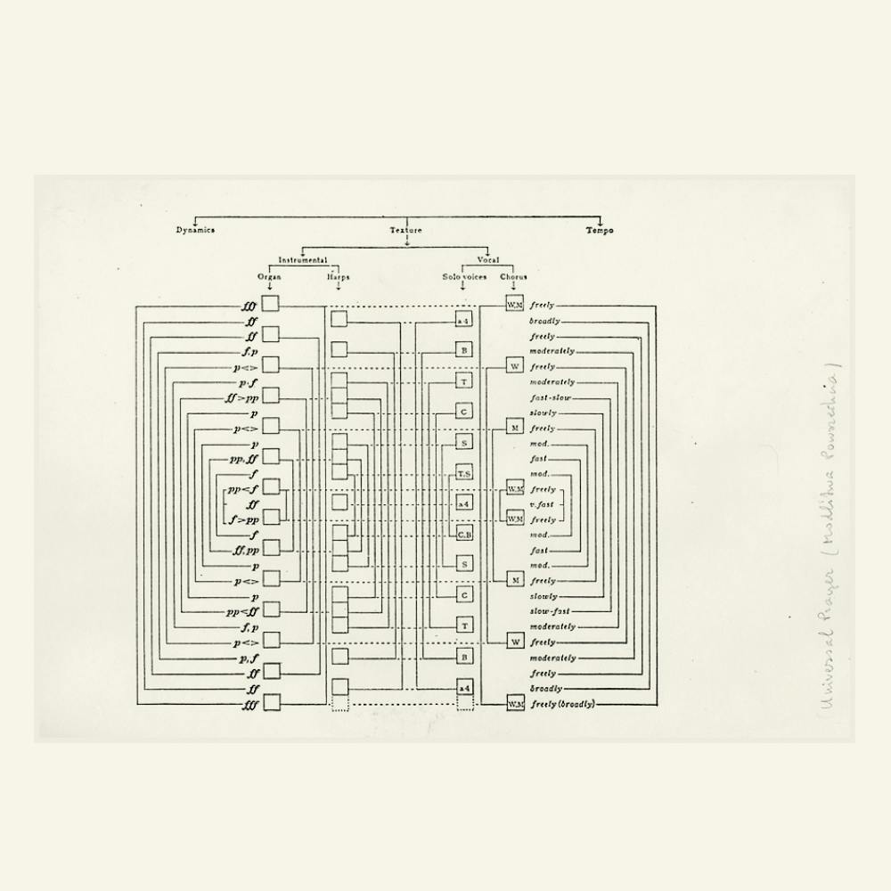
Andrzej Panufnik, Universal Prayer (1968–69)
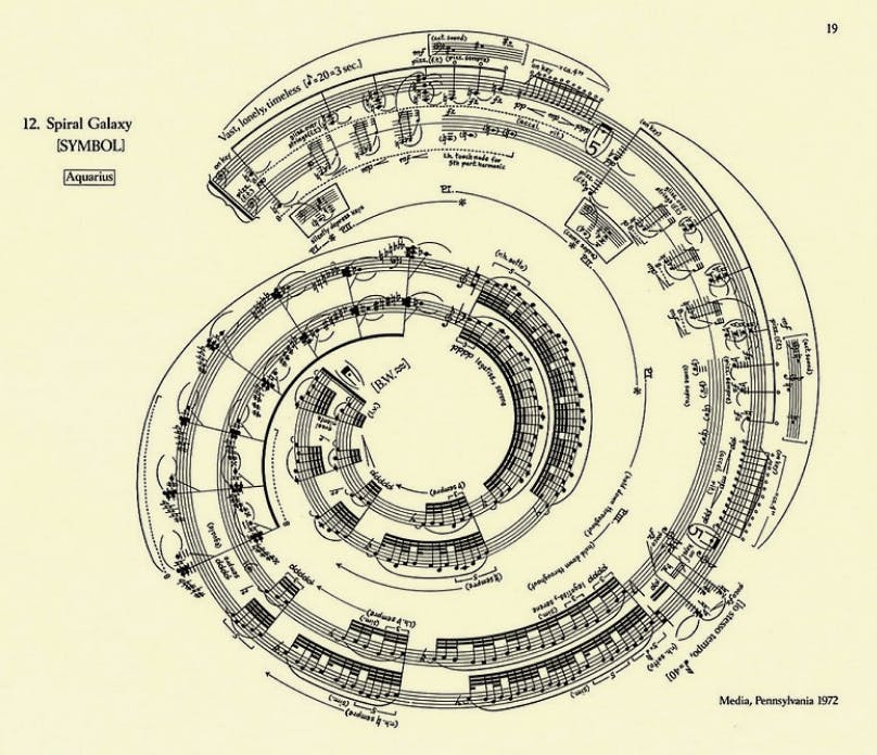
George Crumb, Spiral Galaxy (1972)
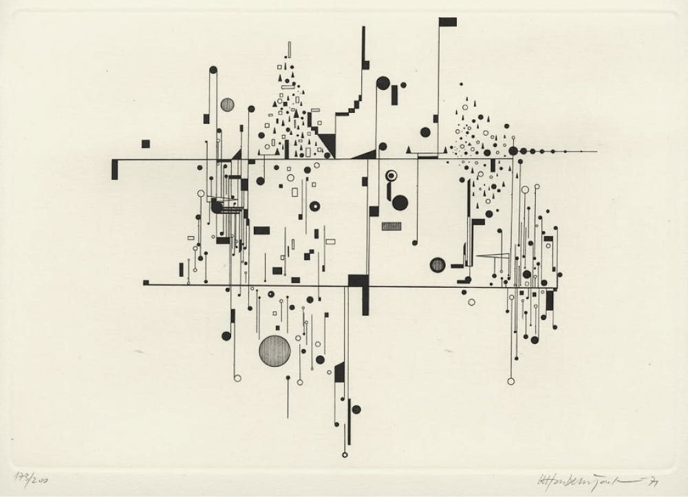
Roman Haubenstock-Ramati, Konstellationen (1972)
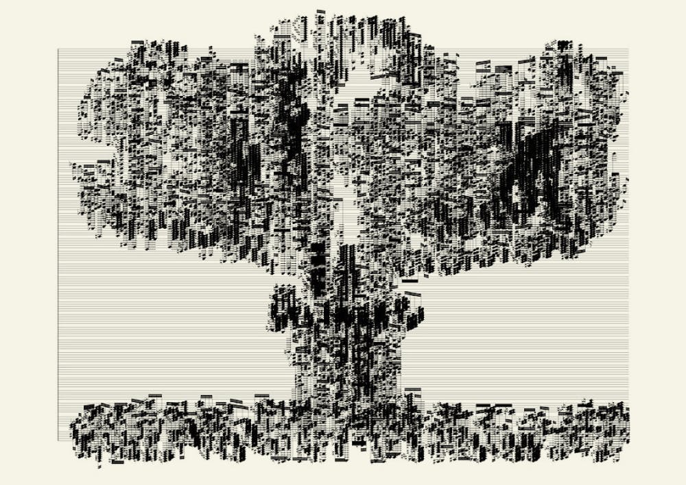
Albert Bernal, Impossible music #9 (2006-)
Works cited
- Manuscrits de la Bibliothèque de Valenciennes by Bibliothèque nationale de France (2012)
- Notations 21 by Theresa Sauer (2009)
- Cardew’s Treatise: the greatest musical score ever designed by David Hall (2020)
- Morton Feldman by Paul Griffiths (1995)
- New Again: Brian Eno by Glenn O’Brien (2016)